You’ve spent time crafting your website—planning, designing, and writing—and now traffic is really starting to pick up.
So, what’s next?
You may be getting a lot of new site visitors, but are they signing up for your newsletter, an upcoming event or even donating to your latest campaign?
Creating an effective and directive call-to-action is the key to converting site visitors to more engaged community members.
Lead visitors to take the next step with your organization through a high-value offer. Think about each of your target audiences and what would really spur them to action. Appeal to what brought them to your website in the first place.
As a nonprofit, you’re offering to help people make a difference alongside you. That’s a big deal! Whether you want to direct visitors toward a donation page or a volunteer form, toward a newsletter signup or an event RSVP, you’re going to leverage the same key elements each time:
- An attention-grabbing header (sometimes accompanied by a brief, straightforward explanation)
- A visually striking call-to-action (CTA)
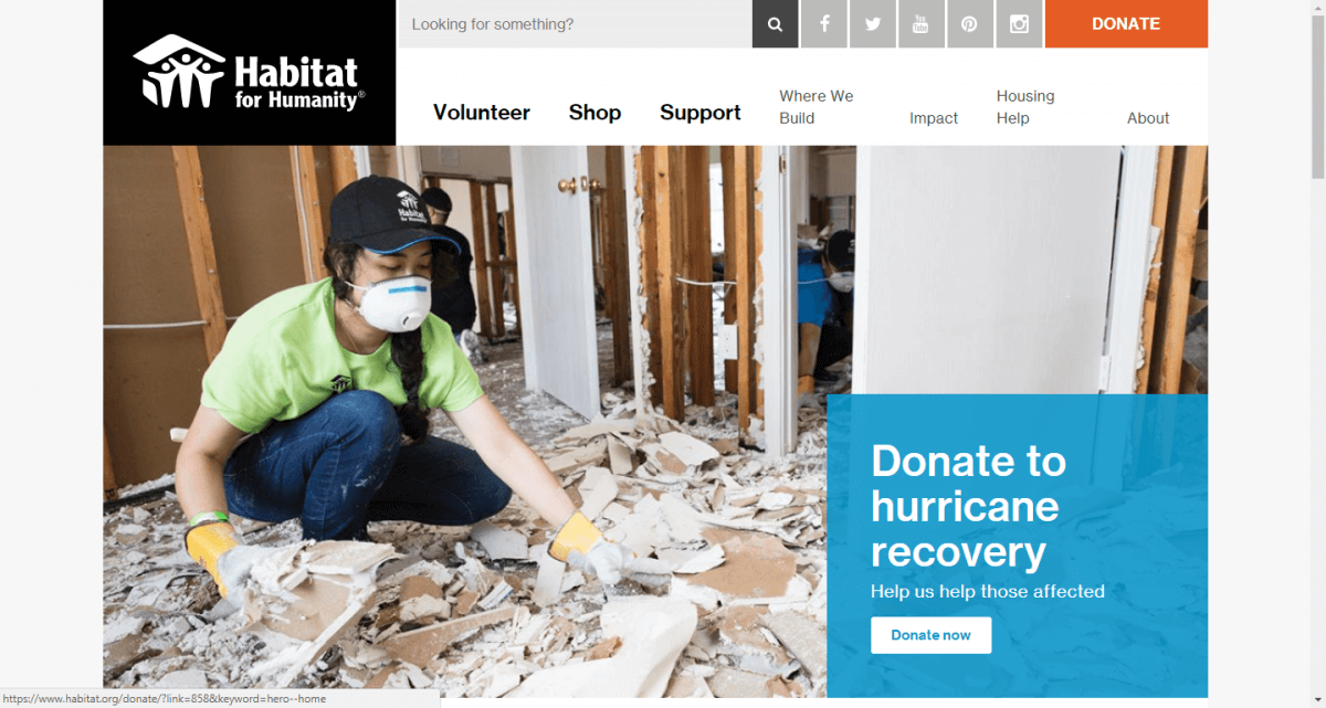
Take Habitat for Humanity, for example. Their homepage leads with an emotional appeal, asking visitors to donate to hurricane recovery. The use of imagery reinforces the need, and its offset by a bold, contrasting box. The verbiage is action-oriented and straightforward.

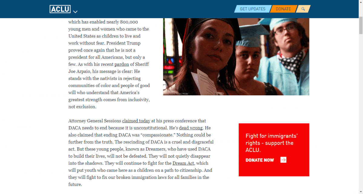
Another great example is the ACLU. Midway through their “DACA Is Ending. But the Movement Is Not.” blog post, a bright red box links the content (legislation affecting immigrants) with the offer (fighting for immigrants’ rights). This tailored approach is seen throughout their site and is an effective means of targeting.

Did you notice something else these two had in common? An implied urgency. They don’t ask you to consider making a donation; they urge you to donate now! The need is real, the world is turning. If you don’t help, who will?
A few more examples of effective, verb-laden CTAs:
- Join the fight!
- Get involved!
- Make a difference in 2017!
- Stop ________.
- Save ________.
Remember, the most important thing is that you cater to your audience and what will help them take the next step—whatever that may be. If you know a page will attract people at two different stages in the decision-making process, it’s okay to tier your offers.
Look at Contra Costa College:

Some prospective students may be ready to apply, but others may just be starting their research. By incorporating two CTAs, the college accommodates both audiences at once.
Key takeaways:
- Know your audience.
- Use emotional, urgent, and action-oriented language.
- Keep your text brief and straightforward.
- Opt for bright colors and bold contrasts.
- Remember the value of your offering. You’re not asking for a favor; you’re recruiting supporters who feel as strongly about the organization as you do. Together, you can make a difference!
