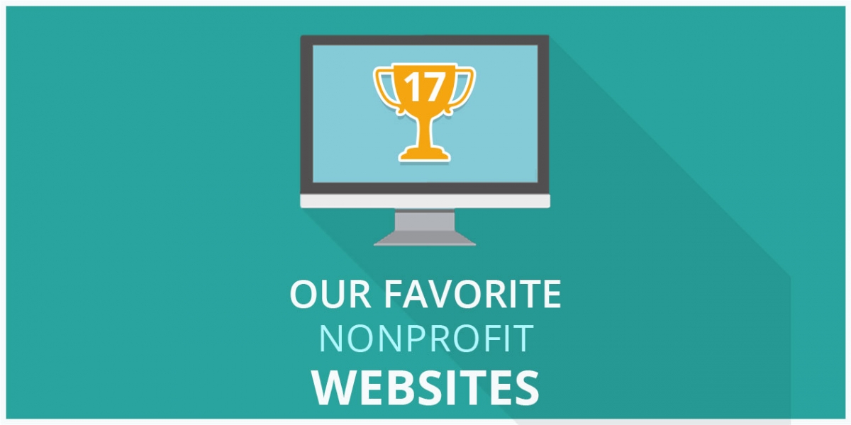
We’re back with our 2017 favorite examples (in alphabetical order) of what a great non-profit website looks like and what makes it stand out.
Our hope is that by emulating these exemplary non-profits, you’ll soon be able to provide an even greater user experience for your own site visitors—generating all the support you need!
acumen.org: Acumen’s color palette is energetic and modern. Their use of angled boxes gives a flare of visual interest, further making them seem like a forward-thinking, innovative and compelling organization. Acumen also does of a good job of showing both the qualitative and quantitative nature of their impact through engaging story-telling and simple, yet bold infographics. Their incredibly strong and authentic photography is the final piece that really sets this website apart.

amnesty.org: Amnesty International’s website combines news site-like feel with clear nonprofit impact. Their home page uses large, compelling photography with an action-oriented visual language. Their newsfeed allows visitors to filter by topic, region/country, and resource type. Combined with directive and clear iconography, this website takes bold and engaging to a new level.
care.org: Care’s website does a great job of showing visitors the various ways they can take action, get involved and share content. Their site illustrates a campaign focused, impactful layout through the use of engaging infographics with clear calls to action. Care’s bold use of iconography and mapping, takes their visual language to the next level.
charitywater.org: Charity Water’s website is well-organized and illustrates ‘hope’ in its truest form. Clear water, happy faces and bright photography are used in perfect balance with simple iconography, impact numbers and well composed calls to action. Lastly, their color palette and typography are both welcoming and approachable and once navigated to, their donate page is simple and unintimidating, making it easy for visitors to support their work.

farmland.org: The American Farmland Trust uses a vibrant, earth-tone focused color palette that feels warm, engaging and modern. They display information in some unique ways such as their navigation dropdown taking the form of a full-page color overlay, their challenge statement is displayed through interactive statements paired with colorful infographics and impact numbers paired with compelling photography. Their internal pages display layers of information on a single page through clear hierarchies and language.
feedingamerica.org: Feeding America’s use of bold colors, large photography and unobtrusive text overlays is simple, direct and to-the-point. Their content strategy is excellent—they know their audience(s)— headlines like, “No one can thrive on an empty stomach,” are extremely compelling and give site visitors an engaging introduction to the importance of their work.
gatesfoundation.org: The Gates Foundation website stands out with an extremely clear and well organized site navigation. Though they utilize a more minimalist approach with a mobile-focused, pop-out menu, site visitors are able to quickly and easily expand sub-menus to see the full depth and breadth of this organization. Their typography is also an excellent example of classic and modern, serif and sans-serif well combined for a sophisticated legibility.
girleffect.org: Girl Effect’s about page guides you through a carefully crafted narrative. They clearly and directly explain why they exist, what the issue is that they solve and the impact statistics that support their work. Girl Effect’s writing is engaging and easily digestible, inspiring site visitors with their energy, optimism and ambition.

globalfundforwomen.org: Global Fund for Women combines striking visuals with bold color and modern typography, creating an engaging and sophisticated home page. Their ‘grant-making’ ‘voice’ and ‘join’ triad illustrates an ideal content strategy and information architecture—guiding site visitors from understanding their work to a clear call to action. Internally, in addition to traditional monetary gifts, the Global Fund for Women’s donate page encourages support in a variety of forms, i.e. cause marketing, corporate matching, etc.

KIPP.org: KIPP’s website utilizes a vertically oriented, color block layout that offers succinct information about their work. Small animations are included to give a sense of light-hearted professionalism. Color overlays, tabbed interfaces and a variety of sliders are used to conserve space while allowing site visitors to smoothly peruse content more deeply.
namesforchange.org: Names for Change has a visually appealing, masonry layout with a unique and compelling interactivity—it truly makes you want to ‘play.’ Their color palette is vibrant, warm and accessible with clear contrast. The site’s simple language and modern typography gives a sense of innovative social change. Furthermore, Names for Change’s use of page overlays rather than click away pages allows users to quickly and effectively absorb information before returning to the main landing page.

nature.org: The Nature Conservancy’s home page is an excellent example of large, beautiful photography, sophisticated typography and a modern layout that is approachable, engaging and has an excellent page hierarchy. Their minimalist use of iconography, combined with a back and forth grid format, ads visual interest without over-crowding the white space. Finally, The Nature Conservancy hosts a carbon footprint calculator as a content offering to drive traffic that may not be as familiar with their work or website.
onedrop.org: One Drop’s website has a sophisticated modernity illustrated through its blue-centric yet warm color palette, action-oriented typography and compelling photography. The site makes good but sparing use of animations, clean and directive information architecture and bold infographics to help site visitors move smoothly throughout the site and engage more deeply.
oxfamamerica.org: Oxfam Foundation’s visual language has a youthful vibrancy all its own. Taking a different approach than similar organizations, their color palette is bright and endearing, using a chunky paper cut-out motif for iconography and typography.

pawschicago.org: Paws Chicago’s home page illustrates well-crafted, meaningful information sharing. Their header bolsters their impact numbers by tying them to navigation right off the bat. Rather than using a slideshow, they have a nice News & Features carousel that highlights import information directly below the first ‘fold’—giving it weight and allowing site visits to jump into what’s new. Continuing down the page, site visitors are given a clear understanding of Paws Chicago’s work is important, what they do and ample opportunities to engage, learn more and donate.
possiblehealth.org: The Possible Healthcare website is a very simple brochure. It does a very good job of staying extremely lean and making good use of 3rd party softwares rather than trying to have the website do its own heavy lifting (Classy for donations, BambooHR for job postings, and clever use of Medium for blog posts and the spreading of their work on a more international platform). A newsletter popup with a compelling photo and tagline captures visitors’ attention on Possible Healthcare’s site

wcs.org: The Wildlife Conservation Society’s home page is full of bright images of animals, yet still finds a way to give your eyes space to rest along the way. Their left-hand menu is stationary throughout and though it takes up slightly more real estate than a top, horizontal menu, its ‘stillness’ and color palette are welcoming and calm in contrast to the activity of the page content. Internal pages again have bold photography and modern typography with the navigation tucked away into a mobile menu.
By focusing on certain website elements (i.e. navigation, layout, forms, opt-ins, calls-to-action, content offerings, etc.), nonprofits like these have been able to generate swells of interest and support online. If you haven’t already, you might consider giving some of their techniques a try!