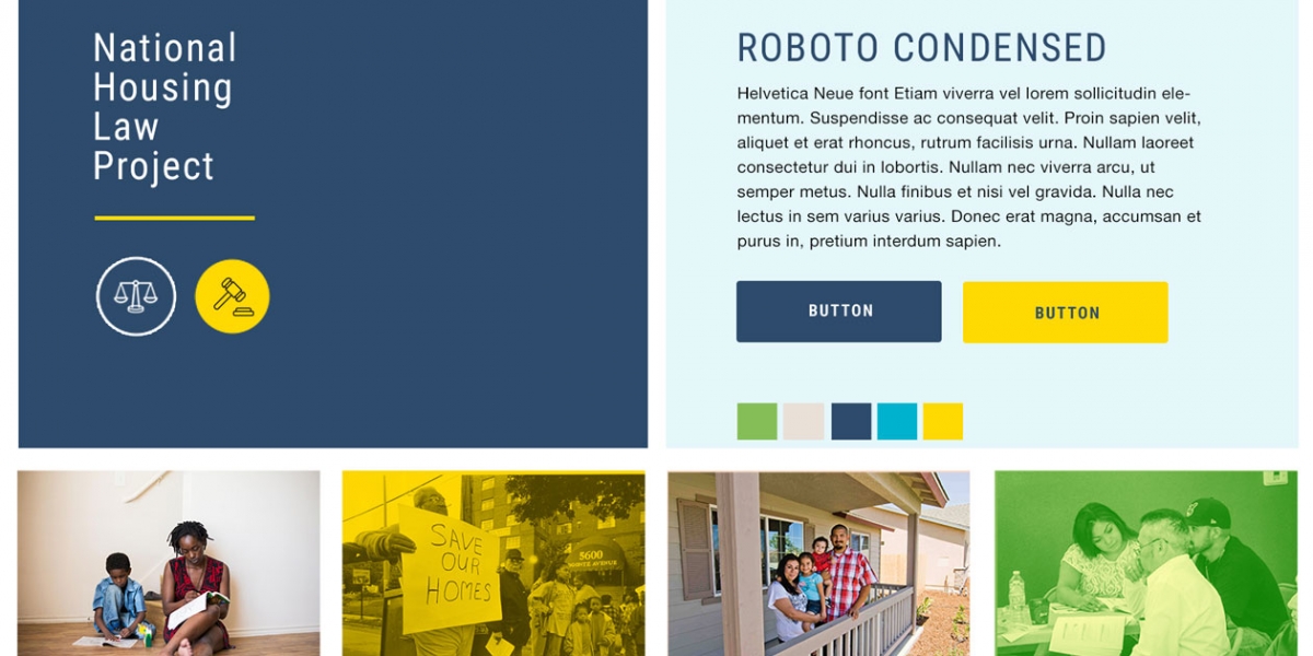
Maintaining a consistent visual presence is hard. Creating a quick brand guide can help you ensure everyone in your organization is maintaining a consistency in all of your marketing materials.
Here’s how to get started in 4 simple steps!
1. Pick 1-2 fonts
You do not need to be a typographic guru to know what fonts look good together and what ones don’t.
The first font you choose should be something that you would want to use for headers on your print and web materials. We often time encourage people to choose something with a little more “character” but that is still easy to read. Make sure it “goes” with your logo or is even the same font you use in your logo. Look through MyFonts.com or Google Webfonts and search by the key terms or core values you defined in your branding process.
The second font you choose should be something that is even easier to read and will work well as body text across your print and web materials. Choosing a font family that is flexible and has thin/narrow options, bold, extended and black will get you the furthest.

2. Create a color palette
2-3 colors is fine, you do not need a huge assortment to feel visually cohesive. Actually, less is more. Assume that white and black are automatically in your palette and thus not addressed here. Think back to your headers, what color are they on your print materials or website now? Are they the same in both places? If not, they probably should be. Overall, it is good to pick 1-2 brighter colors to use for accents and then think about something additional that is more neutral. Also consider using lighter and darker tones of the same color (hue) you are already using…lightening up (adding white) to your header color and then using it for a sub-header is a nice way to have something feel cohesive without needing to choose an additional color. A great place to try things out is Colourlovers.com — again make sure everything you choose goes wtih your logo as well. If you already have a blue and gray logo, those should be 2 of your colors. If you are wanting a change…then that is a different conversation and see our article on revitalizing your brand.
3. Texture
Not everyone likes or wants texture, but it should be considered either way. If you already know you want your colors and backgrounds to be flat, that is still a texture…ie. flat, smooth, clean, etc. Or maybe you want a little more of a grunge feel, or something else that has a tactile or 3-D quality to it. A nice place to try out background textures and patterns is SubtlePatterns.com — yes this is focused on websites, but it at least gives you a way to try out what you might like or not and then you can apply a similar pattern to your print materials.
4. Imagery
Choose 1-3 main photos and/or illustrations and another 4-7 images that you can use interchangeably but are consistent across all of your materials. Often times you can even just pick one main image plus your logo and get pretty far with that “defining” your brand. But, you will still need a few more to use in print and social media. Visit istockphoto.com, flickr or even just Google and type in your key words and see what images come up. If you do not want to purchase stock photos or images, you can hire a designer to create custom artwork for you.
Get Feedback on Your Visual Brand
Feedback and revision is critical to any process. The same is true for building a visual brand or language that speaks to your audience.
Stakeholder interviews are a great way to get feedback from your audience. But, make sure that you’re asking the right questions! We can guide you through it. Download our full guide to conducting stakeholder interviews.

