Imagine going to a new grocery store and not having a clue where anything is. There are signs, but they’re vague and confusing. Maybe they’re so obscure you don’t notice them at all. Would that make for a good first impression? If you’re anything like us, you wouldn’t make a return visit anytime soon.
Now shift that scenario from a store to a website.
The same principles apply. If the navigation isn’t clear and inviting, chances are, you won’t bookmark it to visit again—or worse, you’ll leave without exploring any further. So, what can be done to save our own websites from this fictional fate? Let’s take a look at six organizations with an abundance of navigational inspiration.
6. Earthjustice.org
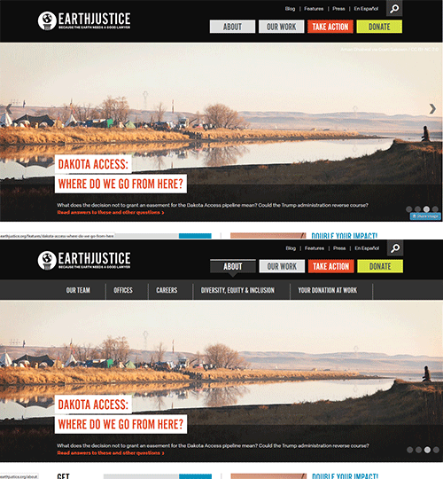
EarthJustice uses color-coded horizontal navigation to differentiate informational tabs from calls-to-action. Upon hover, second and tertiary levels drop down in easy to follow menus.
5. Headlands.org
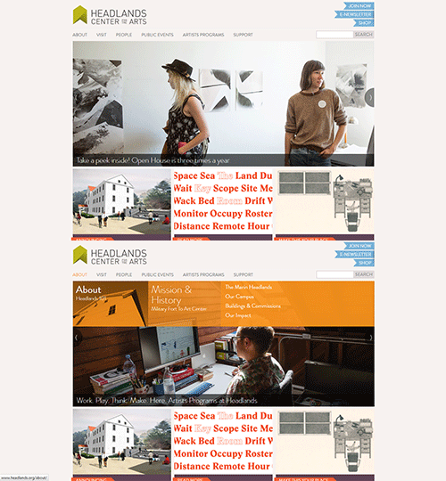
Headlands Center for the Arts also color codes their horizontal navigation, but instead it’s upon hover, where secondary levels are highlighted.
4. GatesFoundation.org
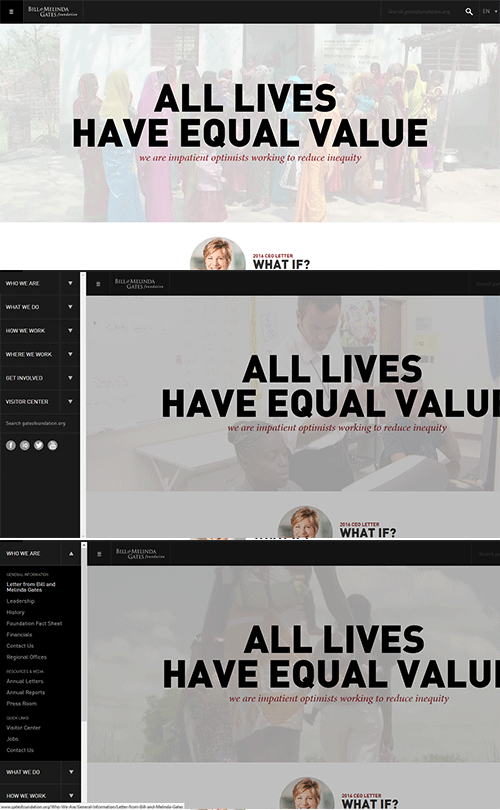
The Bill & Melinda Gates Foundation uses a minimalist approach by containing its navigation within a menu symbol in the upper left corner. Once clicked, vertical categories appear on the left side with dropdown arrows to expose further sublevels.
3. Comedy Central
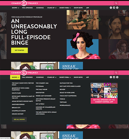
Comedy Central has a horizontal navigation that changes color and drops down upon hover, displaying alphabetized secondary menus.
2. AIGA.org

AIGA differentiates itself by dropping a semi-transparent gradient over the content, upon hovering over its horizontal navigation. Visitors can focus on navigational options, while still viewing the page they landed on.
1. HugeInc.com
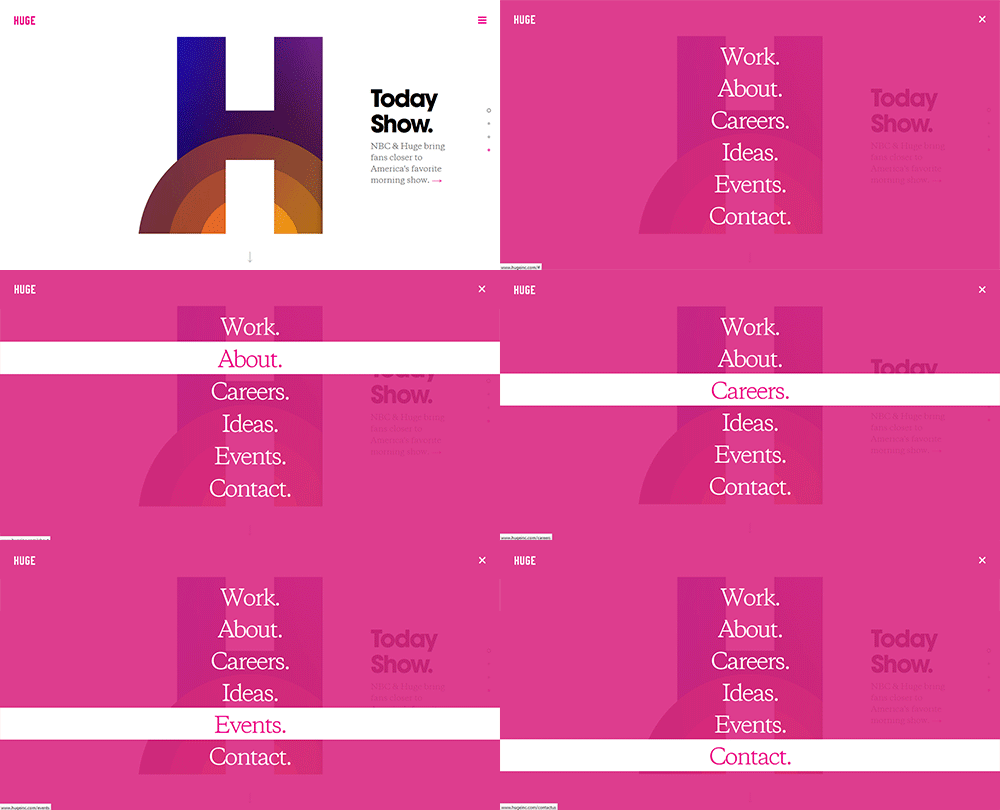
This larger full screen overlay is responsive friendly, and gives you the ability to tuck away your main navigation items while still giving them full attention when called upon. A little bit more intense than the AIGA example, but another well designed and engaging option.
Navigation and Donations
You’d be surprised how much navigation can affect the amount of donations that your website receives. To help navigate this, we’ve put together a comprehensive guide to boosting your organization’s online donations.
We demystify the technology and strategies that make it easy to raise more money.
