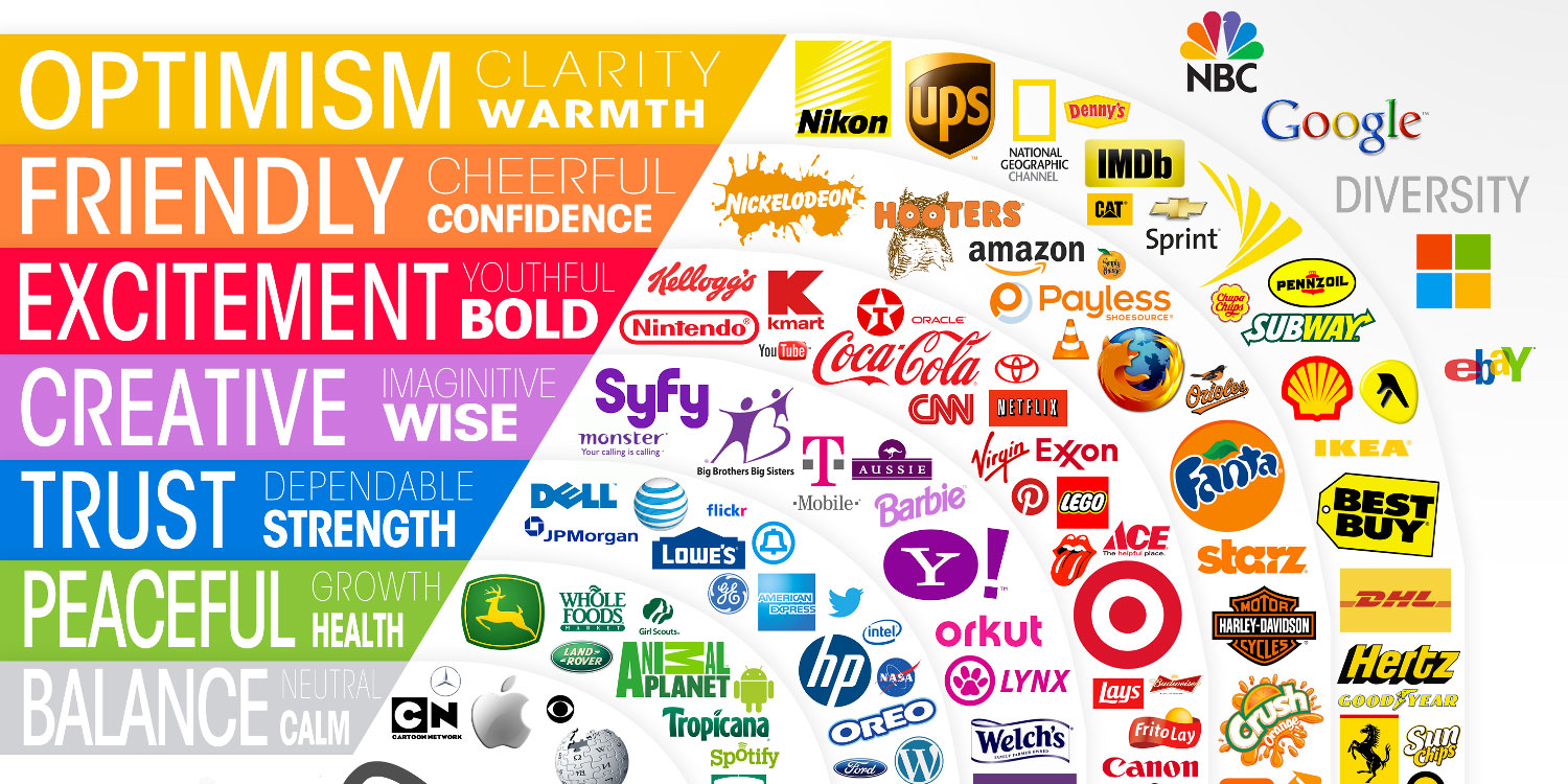
How do you make visual language decisions and why?
Current trends vs. universal constants need to be considered, as well as cultural contexts, ie. what may seem ‘standard’ in the US or for English speakers, maybe be very different elsewhere. If we are in a more pastel phase vs. electric colors vs. more earth tones. There was a period where everything in the tech world was blue and round to follow facebook — to feel friendly and trustworthy. But that is not always the case, so that particular trend soon begins to feel “played out.”
Here is a list of what different colors are often times associated with (in western culture) to help you choose your next color palette.

Red: Excitement, energy, passion, love, desire, speed, strength, power, heat, aggression, danger, fire, blood, war, violence, all things intense and passionate, sincerity, happiness (Only in Japan) — when using red, it is important to consider that it also means “stop,” so probably best not to use it for a button you really want people to click.
Pink symbolizes love and romance, caring, tenderness, acceptance and calm. Keep in mind, as much as this is finally starting to change, pink is not always the most “gender neutral” color to use.
Beige and ivory symbolize unification. Ivory symbolizes quiet and pleasantness. Beige symbolizes calm and simplicity. These are both great colors to use as a neutral tone in your palette. Or if you think a white background is too sterile, these are nice colors to use to warm things up more subtlely.
Yellow signifies joy, happiness, betrayal, optimism, idealism, imagination, hope, sunshine, summer, gold, philosophy, dishonesty, cowardice, jealousy, covetousness, deceit, illness, hazard and friendship. Uh, yeah, it can mean a lot of things, so be careful how you use it and what shade you are using. The negative words tend to be associated when the yellow is a cooler tone, the cheerier when it is warmer and closer to orange.
Dark Blue: Symbolizes integrity, knowledge, power, and seriousness. This can also feel cold, sterile and removed, so use it carefully. Colleges and universities use dark blue a lot, but often pair it with gold or teal or a warmer shade of blue.
Blue: Peace, tranquility, cold, calm, stability, harmony, unity, trust, truth, confidence, conservatism, security, cleanliness, order, loyalty, sky, water, technology, depression, appetite suppressant. Blue is use A LOT because it can stand alone really well and mean a lot of different things. Think Facebook, Samsung, GE, Ford, Intel, HP, GAP, even the UN.
Turquoise symbolizes calm. Teal symbolizes sophistication. Aquamarine symbolizes water. Lighter turquoise has a feminine appeal. The more minty shades feel the most tranquil and are often used for meditation type companies.
Purple: Royalty, nobility, spirituality, ceremony, mysterious, transformation, wisdom, enlightenment, cruelty, honor, arrogance, mourning, temperance.
Lavender symbolizes femininity, grace and elegance. Again, this is not always the most “gender neutral” color to use…and can often come across more youthful than you may want.
Orange: Energy, balance, enthusiasm, warmth, vibrant, expansive, flamboyant, demanding of attention. This is a great “Call to Action” color, which is why you will so often see it used for donate buttons on websites.
Green: Nature, environment, healthy, good luck, renewal, youth, spring, generosity, fertility, jealousy, service, inexperience, envy, misfortune, vigor. Please note that darker and more “Autumn” shades are more environmental feeling, bright grass greens are more “Spring” and the fluorescents get into the envy and misfortune end of the specturm. There is a reason the Matrix movies use fluorescent green.
Brown: Earth, stability, hearth, home, outdoors, reliability, comfort, endurance, simplicity, and comfort. Brown is a great and warmer alternative to black. You don’t see it used that much on websites or branding, but it works.
Gray: Security, reliability, intelligence, staid, modesty, dignity, maturity, solid, conservative, practical, old age, sadness, boring. Silver symbolizes calm. This is another good neutral color that can warm up a palette that feels stark while still allowing a lot of open, empty space.
White: Reverence, purity, birth, simplicity, cleanliness, peace, humility, precision, innocence, youth, winter, snow, good, sterility, marriage (Western cultures), death (Eastern cultures), cold, clinical.
Black: Power, sexuality, sophistication, formality, elegance, wealth, mystery, fear, evil, unhappiness, depth, style, sadness, remorse, anger, anonymity, underground, good technical color, mourning, death (Western cultures), austerity, detachment.
Here are 2 more articles for more about the science symbolism of colors:
Need help getting creative? Mood boards are an effective way to discuss ideas, share insights, and clarify communication. They help visually explain a feeling and, in turn, develop a more authentic and successful brand.

