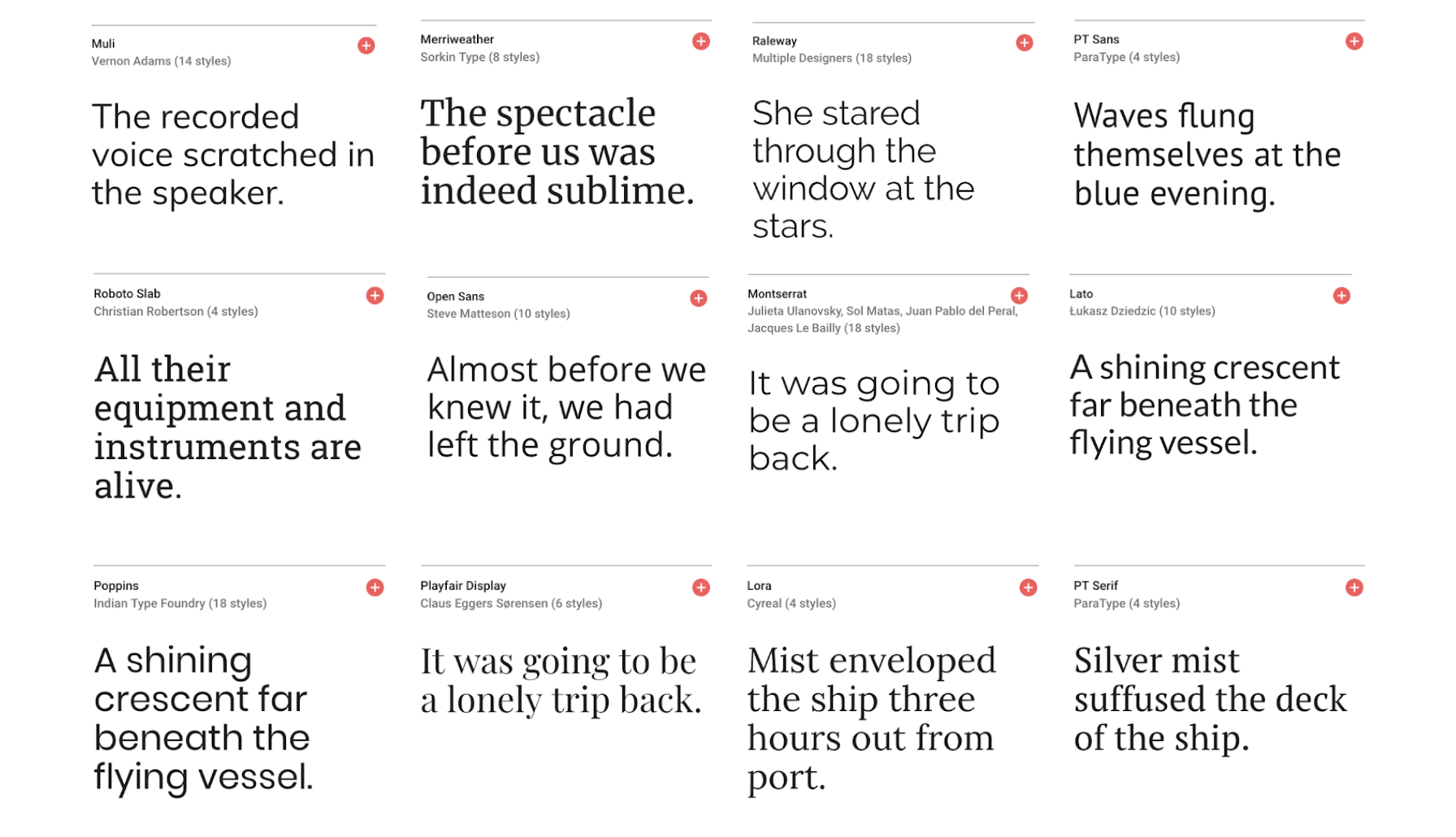
There are a few basic prinicpals to keep in mind when choosing typography whether it is for print or web design. Let’s start with what needs to be considered for both and then we will focus on web design specifically.
Personality & Tone
The first and most important thing to consider is what you want your typography to “say” to your viewer. Different fonts have different personalities and will evoke specific feelings or moods. Historically, more modern fonts tend to be sans-serif and rounder. If you want greater impact, choose something bold, thick and/or tall. But keep in mind, choose carefully and limit the number of fonts used on a single page so that you do not overwhelm and distract from your content.
Visual Heirarchy & Scanability
Once you start designing a layout (whether for print or web), making proper use of headings, sub-headings and other levels of text will help your reader (and the google bots) better be able to scan and more quickly gather important information.
Contrast & Readability
There are two different ways to think about contrast and how it relates to typography best practices. 1. What fonts you are using and 2. How your fonts are displayed on a page or screen. Once you have considered tone and scanability, next you need to decide if you want your heading fonts to be different than your body text. Again, limit the number of fonts you use—don’t create a big ‘ol mess—consider staying within a single font family or using one contrasting font to add personality. Now, think about how your typography is going to show up on the page. What background colors are you using? Make sure that your text can be read from far away or under different lighting conditions. This is especially important for mobile devices which are often viewed in the sun…your words need to be easily viewed when dealing with glare, etc.
Space
Whether setting text for print or web, line-height and spacing is important. For print, the general rule is 1.5 times the “x” height. For web it is a little looser and actually, it is often easier to read text on small screens if the light-height is 2 “x” or higher.
Fonts
Below are commonly used “standard” web-fonts that we think are particularly strong:
- Verdana, sans-serif
- Georgia, serif
- Arial, sans-serif
- Helvetica, sans-serif
- Tahoma, sans-serif
- Trebuchet MS, sans-serif
- Palatino Linotype, Palatino, serif
- MS Serif, serif
We really like using Google Web Fonts, which are free, but do not always have the highest quality. That being said, the ones included below are strong and we have found work across most browsers and systems. (However, be advised, Microsoft Outlook does not support Google Web Fonts.)

- Open Sans, sans-serif
- Josefin Slab, serif
- Arvo, serif
- Lato, sans-serif
- Vollkorn, serif
- Abril Fatface, serif
- Ubuntu, sans-serif
- PT Sans + PT Serif
- Raleway, sans-serif
- Old Standard TT, serif
- Droid Sans, sans-serif
Finally, there are a lot of other online resources for “not-so-free” fonts including Typekit, Fonts.com, Fontdeck, Webtype, FontSquirrel, MyFonts.com, or FontSpring. Some fonts we like from there that are not necessarily free are:
- Proxima Nova, sans-serif
- Museo Slab, serif
- League Gothic, sans-serif
- Univer, sans-serif
- Futura Medium, sans-serif
- Rockwell, serif
