There are a variety of ways of approaching logo design as well as determining what makes a good logo. We choose an approach that is extremely collaborative and iterative with our clients, focusing on the following concepts: simplicity, appropriateness, distinction, and practicality.
Simplicity
First and foremost, a good logo is easy to recognize—it is versatile and of course memorable. Keeping it simple, means trying not to incorporate too many ideas into one image. Ask yourself, “What is the most important thing for people to understand about this brand? What is its most important value or service?”
Appropriateness
Creating a beautiful mark is important, but the idea you are communicating to your audience is the key to this process. Begin by rooting any idea in the core values/inspiration of the business or organization you are designing a logo for. Keep in mind you are ‘teaching’ about this brand—visually representing its personality, values and what it does in a single idea. Not sure where to begin? Read our article How to Revitalize your Brand »
Distinction
Creating something unique is not always the easiest thing considering the amount we are bombarded by advertisements and branding everywhere we look. That being said, every business and organization has something distinct that it provides to the world. Figuring out what that one thing is, is the key to its logo. For Rootid, we focus on collaboration and being rooted in the values of the organizations we work with…hence we have small roots coming out the bottom of the “r” in our logo. It is a simple idea, distinct and illustrates tour most important core value.
Practicality
There are a lot of logos out there that are difficult to read, are combining too many different ideas and elements, or are impossible to reproduce across different media. A great logo takes all of this into consideration, and at the end of the day, is practical. Think about what your logo will look like as a square avatar on Facebook, or horizonatally across the top of a website. Will it still look good small on a business card as well as on a huge banner overlooking the freeway? When you are putting it on a t-shirt, does it have too many colors so it will be really, really expensive to reproduce and will need many different screens? You may not need all of these use cases, but it is important to consider them.
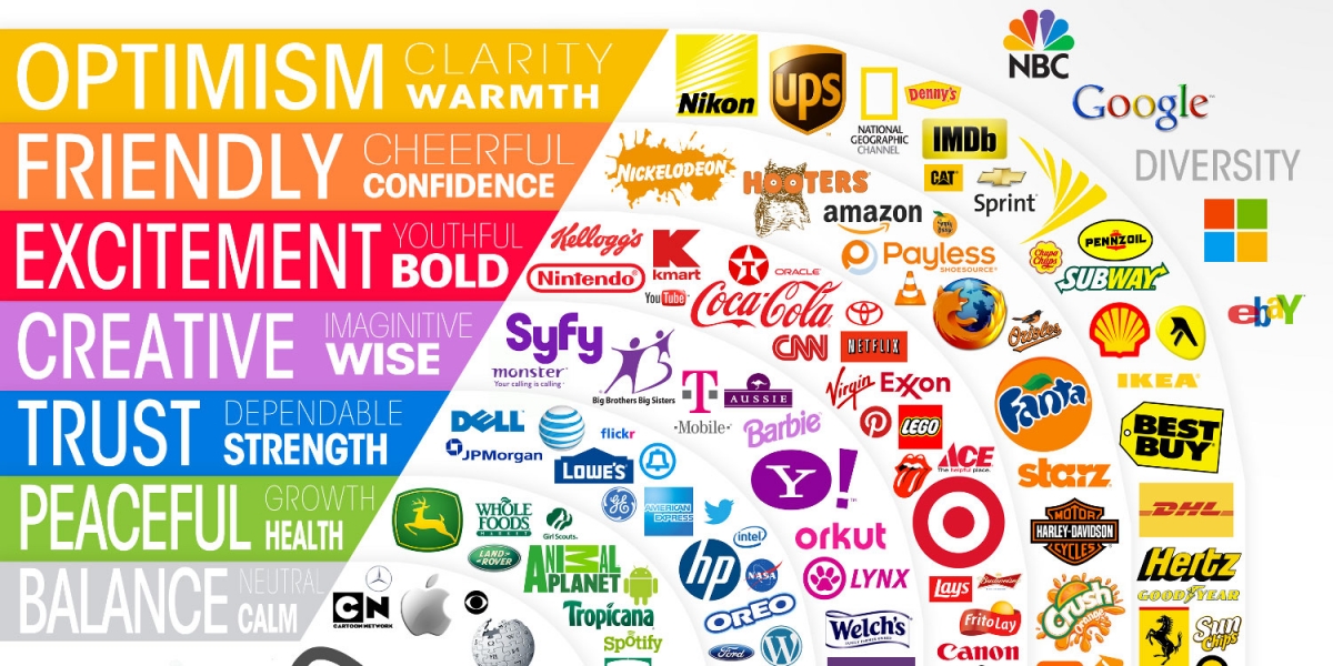
Enduring?
Though there does need to be a timeless quality to any great logo, there also needs be thought around its evolution. Businesses and organizations are organic in nature, they change and adapt as they grow and develop. Therefore, a logo that is created at ‘founding’ will not necessarily still suit you perfectly 3, 5, 10, 20 years down the line. Take a look at these logos of well known corporations and how they have changed over the years…just to give a sense of what to expect from your own logo’s evolution.
A couple of places to go for inspiration…just don’t copy someone else’s work: LogoMoose | Dribble