Building a logo can be as easy as ABC, or 123…yes, just like the Jackson 5 song. It is composed of basic building blocks of shapes, colors and letters. Just like a children’s cartoon, because really, if it does not read that simply, then you are probably doing something wrong. Think about some of the most famous (and successful) logos such as Nike’s swoosh, Twitter’s bird, or Target’s, well, target.
Logo Design Shape
So let’s start with shapes. Did you know the majority of logos (about 50%) are rectangular shaped? The other 50% are a pretty clean split between squares and circles, with the random organic shapes coming in at less than 10%. Think about what logos are used for these days…often on a website, right? Well that is probably the reason so many logos are rectangular, it is simply easier to place and clearly read across devices without taking up too much vertical space. That being said, you do still need to consider the square or circular version of a logo because they are needed for profile pictures for your social media accounts. So, ultimately, it is best to have a logo that reads well at small sizes and can work no matter the space it needs to fit in.
Logo Color Theory
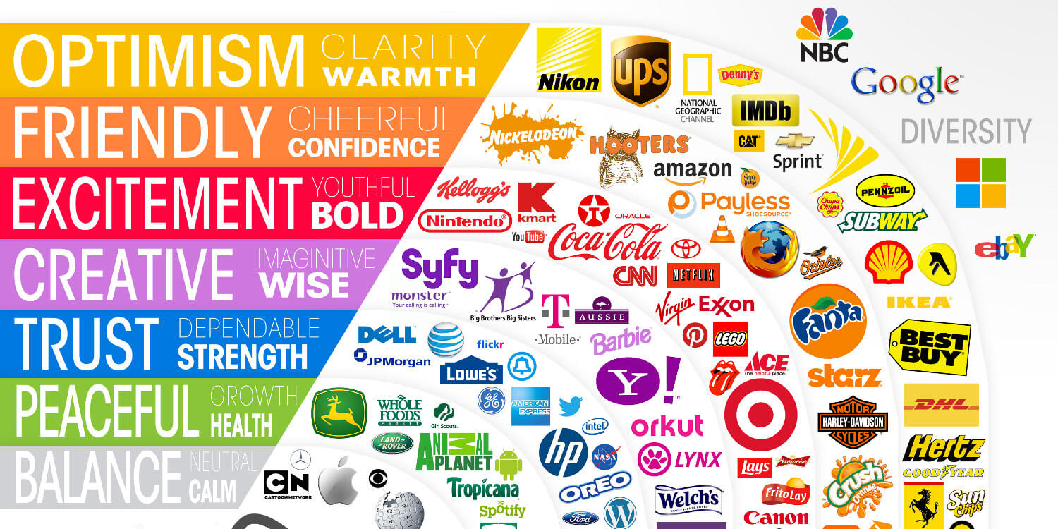
Now, how do you choose a color (or colors) for your logo. What do you want it to feel like? Before you begin to play with color, make sure your logo works in just black, you want to make sure that color is enhancing what you already have and not carrying your message. Here is a list of what different colors are often times associated with (in western culture).

Red: Excitement, energy, passion, love, desire, speed, strength, power, heat, aggression, danger, fire, blood, war, violence, all things intense and passionate, sincerity, happiness (Only in Japan) — when using red, it is important to consider that it also means “stop,” so probably best not to use it for a button you really want people to click.
Pink symbolizes love and romance, caring, tenderness, acceptance and calm. Keep in mind, as much as this is finally starting to change, pink is not always the most “gender neutral” color to use.
Beige and ivory symbolize unification. Ivory symbolizes quiet and pleasantness. Beige symbolizes calm and simplicity. These are both great colors to use as a neutral tone in your palette. Or if you think a white background is too sterile, these are nice colors to use to warm things up more subtlely.
Yellow signifies joy, happiness, betrayal, optimism, idealism, imagination, hope, sunshine, summer, gold, philosophy, dishonesty, cowardice, jealousy, covetousness, deceit, illness, hazard and friendship. Uh, yeah, it can mean a lot of things, so be careful how you use it and what shade you are using. The negative words tend to be associated when the yellow is a cooler tone, the cheerier when it is warmer and closer to orange.
Dark Blue: Symbolizes integrity, knowledge, power, and seriousness. This can also feel cold, sterile and removed, so use it carefully. Colleges and universities use dark blue a lot, but often pair it with gold or teal or a warmer shade of blue.
Blue: Peace, tranquility, cold, calm, stability, harmony, unity, trust, truth, confidence, conservatism, security, cleanliness, order, loyalty, sky, water, technology, depression, appetite suppressant. Blue is use A LOT because it can stand alone really well and mean a lot of different things. Think Facebook, Samsung, GE, Ford, Intel, HP, GAP, even the UN.
Turquoise symbolizes calm. Teal symbolizes sophistication. Aquamarine symbolizes water. Lighter turquoise has a feminine appeal. The more minty shades feel the most tranquil and are often used for meditation type companies.
Purple: Royalty, nobility, spirituality, ceremony, mysterious, transformation, wisdom, enlightenment, cruelty, honor, arrogance, mourning, temperance.
Lavender symbolizes femininity, grace and elegance. Again, this is not always the most “gender neutral” color to use…and can often come across more youthful than you may want.
Orange: Energy, balance, enthusiasm, warmth, vibrant, expansive, flamboyant, demanding of attention. This is a great “Call to Action” color, which is why you will so often see it used for donate buttons on websites.
Green: Nature, environment, healthy, good luck, renewal, youth, spring, generosity, fertility, jealousy, service, inexperience, envy, misfortune, vigor. Please note that darker and more “Autumn” shades are more environmental feeling, bright grass greens are more “Spring” and the fluorescents get into the envy and misfortune end of the specturm. There is a reason the Matrix movies use fluorescent green.
Brown: Earth, stability, hearth, home, outdoors, reliability, comfort, endurance, simplicity, and comfort. Brown is a great and warmer alternative to black. You don’t see it used that much on websites or branding, but it works.
Gray: Security, reliability, intelligence, staid, modesty, dignity, maturity, solid, conservative, practical, old age, sadness, boring. Silver symbolizes calm. This is another good neutral color that can warm up a palette that feels stark while still allowing a lot of open, empty space.
White: Reverence, purity, birth, simplicity, cleanliness, peace, humility, precision, innocence, youth, winter, snow, good, sterility, marriage (Western cultures), death (Eastern cultures), cold, clinical.
Black: Power, sexuality, sophistication, formality, elegance, wealth, mystery, fear, evil, unhappiness, depth, style, sadness, remorse, anger, anonymity, underground, good technical color, mourning, death (Western cultures), austerity, detachment.
Here are 2 more articles for more about the science symbolism of colors:
Letters
Last but not least, there are letters, well fonts (typography). How do you choose whether to use modern or classic, a serif, sans-serif, or handwritten font? Strong typography can be tricky and needs to take into consideration a variety of factors. This post is about how to keep it simple, so here are some basic guidelines. Do you want modern and tech feeling? Use a sans-serif font. The more rounded, the more modern it will feel, the more sharp= action oriented, narrow= more classic and sophisticated. Want something approachable? Use a handwritten font. Serif fonts are best for large blocks of text or logos that need to feel more serious and mature. Note, there are a lot more nuances here so for more in-depth information read, “Web Typography Best Practices.”
Read more about the conceptual parts of What Makes a Great Logo or Learn to Moodboard to help you get creative.
A good logo is not an all you can eat buffet, so keep it simple.

