When someone chooses to give online, they’re doing something generous and meaningful. Our job, as stewards of that generosity, is to make the experience clear, respectful and supportive—never confusing or pushy. There’s rarely a universal answer for what works best.
As with all of our work, practice of curiosity, care and testing are important. That’s why questions like “Should we use a pop-up donation form or a full-width page?” don’t have one answer.
There Is No Single “Best” Format—Only What Works Best for Your Target Audiences
Testing beats guessing. Pop-ups, overlays and full-page donation forms can all work well when they’re thoughtfully designed, built accessibly and aligned with user intent.
A/B testing allows you to honor your audience by paying attention to how they actually respond. For example, at the start of a campaign, you might split your email list or segment your donor list so half of your donors see a pop-up donation experience and the other half land on a full-width page. The format that performs best can then be used for the remainder of the campaign.
Testing isn’t about chasing trends—it’s about intentional listening.
Designing Pop-ups and Overlays with Care
Pop-ups often get a bad reputation, for their high urgency and click away rates, but when used with intention, they can feel helpful rather than intrusive.
Page overlays can help site visitors simplify their experience since you are guiding them to focus on a single priority. Use overlays sparingly, develop them accessibly and consider mobile users’ experience. Make sure it is not hard to click out of the overlay. If sending people to a new page gets the job done, keep it simple, do that.
Consider using a combination of pop-ups and overlays depending on your audience and desired outcome. Just make sure to utilize cookies so that pop-ups appear only once per visit rather than appearing multiple times, frustrating your visitors.
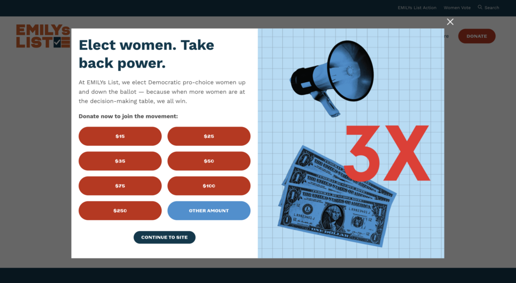
This example from Emily’s List is a good one because it does more than just ask for a donation, it also gives context as well as multiple easy ways to close the overlay.
A few guiding principles can make all the difference:
- Relevance matters most. A pop-up should feel like a natural continuation of what someone is already doing—not a disruption.
- Visual clarity builds trust. Clean design, readable text and accessible buttons help people feel confident moving forward.
- Simplicity is a kindness. Fewer choices and clearer language reduce stress and make giving feel easier.
The goal is never to trap someone into clicking, but to gently invite them into action.
What to Measure (and Why It Matters)
To understand whether a donation experience is truly working, it’s helpful to look beyond surface-level impressions and into meaningful metrics:
- Conversion rate shows how many people actually complete the action you’re inviting them to take.
- Bounce rate helps you see whether a pop-up is causing people to leave instead of engaging.
- Click-through rate reveals curiosity and interest—often an early sign of trust.
- View-through rate (VTR): helps you see what they did next, like visiting another page on your website, scrolling deeper within the page content itself or clicking a donate, sign-up or registration type button.
- Time on page: shows if the overlay increased engagement time.
Together, these metrics tell a part of the story about how donors feel when they encounter your donation form.
Building Better Donation Forms, One Thoughtful Choice at a Time
No matter which format you use, strong donation pages share a few common qualities:
- Clear, consistent branding that reassures donors they’re in the right place
- Short, focused forms that respect people’s time
- Multiple payment options and mobile-friendly design
- Easy ways to share the campaign with others
- Thoughtful follow-ups, like automatic, yet genuine, thank-you emails
Social proof—such as testimonials or donor quotes—can also help donors feel connected and confident. When used ethically, time sensitivity can inspire action without pressure.
Time Sensitive Campaigns Without Pressure
Deadline-based campaigns work best when it feels honest and motivating, not urgent and stressful. Some effective approaches include:
- Time sensitive campaigns paired with genuine donation matching opportunities that are not only geared towards year-end giving
- Progress bars that show how close a campaign is to its goal
- Limited-time challenges that unlock extra funding
These elements tap into human psychology in gentle ways—helping people feel that their gift matters right now.
Choosing the Right Pop-up Format
Different pop-up styles serve different needs:
- Classic pop-ups draw immediate attention and can work well for new visitors
- Exit-intent pop-ups offer a last, respectful invitation before someone leaves
- Slide-ins are quieter and often better for returning visitors or mobile users
The key is matching the format to the moment—and to the device someone is using.
The Psychology Behind the Click
Why do some pop-ups work better than others? Often, it comes down to human behavior:
- We like to finish what we start. Progress indicators tap into that instinct.
- We don’t want to miss out. Limited-time opportunities encourage action.
- Too many choices overwhelm us. Focused designs reduce friction.
- We respond to generosity. Offering value first builds trust.
When design choices are grounded in empathy, they feel supportive instead of manipulative.
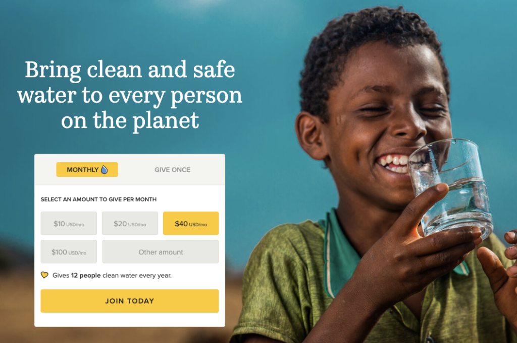
This example from Charity Water has all of the right elements. It is easy to choose between a monthly or one-time donation. The image and text is warm, inviting as well as empowering and the form is easy to use.
Thoughtful Execution Builds Trust
Timing matters. Showing a pop-up too early can increase bounce rates, while waiting until someone has engaged—often around 7 seconds or 35% scroll depth—creates better alignment. Exit-intent triggers remain one of the most effective options because they respect a user’s autonomy.
Equally important: always make it easy to close a pop-up. Clear exit options protect your brand’s integrity and show donors that you respect their choices.
A Gentle Reminder
There’s no perfect formula—only ongoing learning. By testing, measuring and refining your donation experiences, you’re not just optimizing conversion rates. You’re showing donors that you value their time, attention and generosity.
That kindness, more than any format, is what keeps people coming back.
Need a pop-up or donation form?
We have many existing templates or resources you can use…or if you’re looking for a design of your own, we can help with that too.