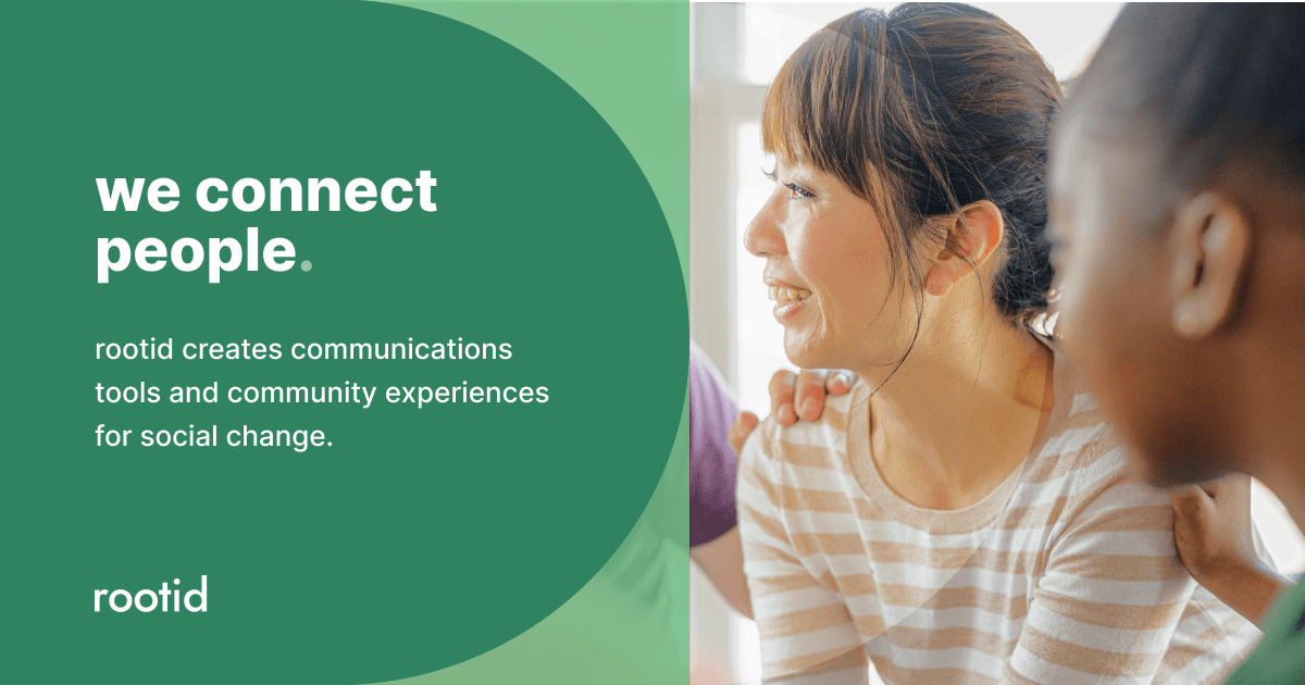
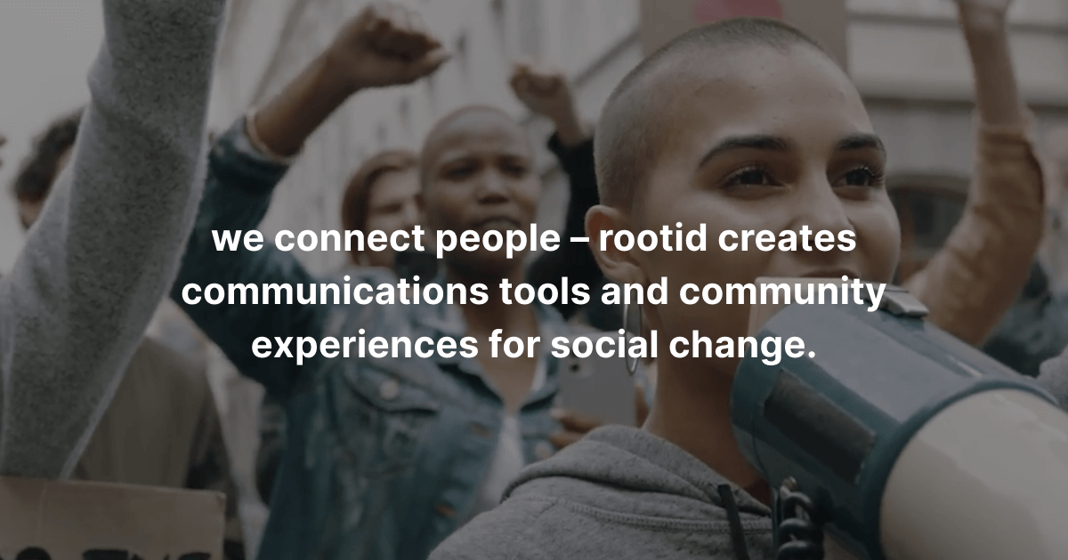
introducing… our new mission statement
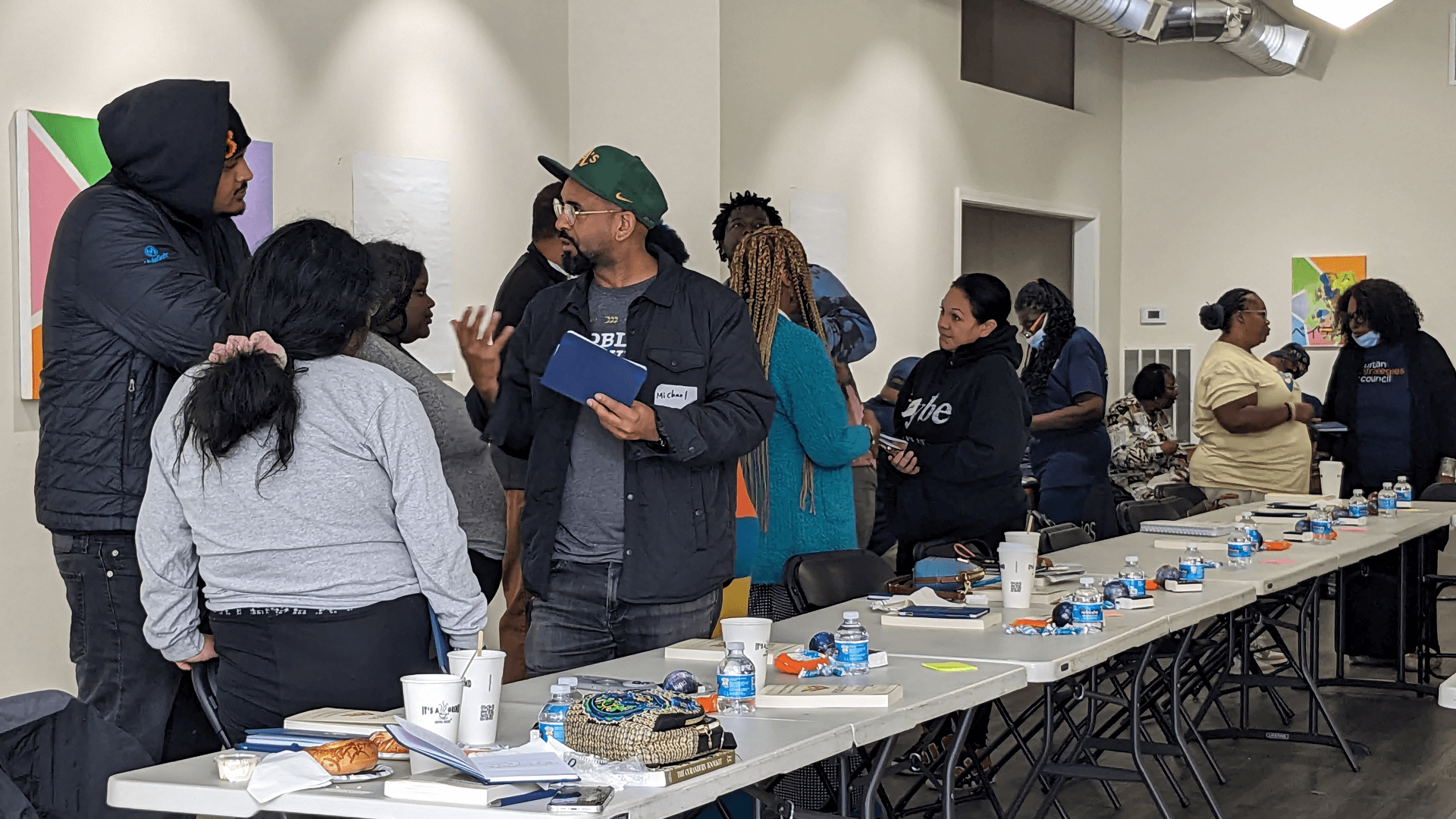
2023 was a year of growth & development for rootid as we completed a number of internal projects including a new strategic plan, updated mission and vision statements, developed new products and systems to meet the needs of our community, restructured our community roundtables & cohorts, and continued improving our horizontal leadership structure.
However, maybe the biggest project we embarked on was our “back door” rebranding process which led to the development of our new visual identity and website. Last week, we had a chance to reflect on the project with our team and discuss why these updates were necessary, how they represent our evolution, and what we hope to achieve through this process.
why rebrand now?
It was necessary to update our branding and website to align with our redefined mission, values and products. Our guiding principles and liberatory approach foster deeper community relationships and allow us to co-create equitable communication tools and spaces. We hope our new branding reflects our vision of warmth and inclusiveness, particularly for underserved nonprofit, grassroots and frontline community members.
how has rootid evolved as an organization?
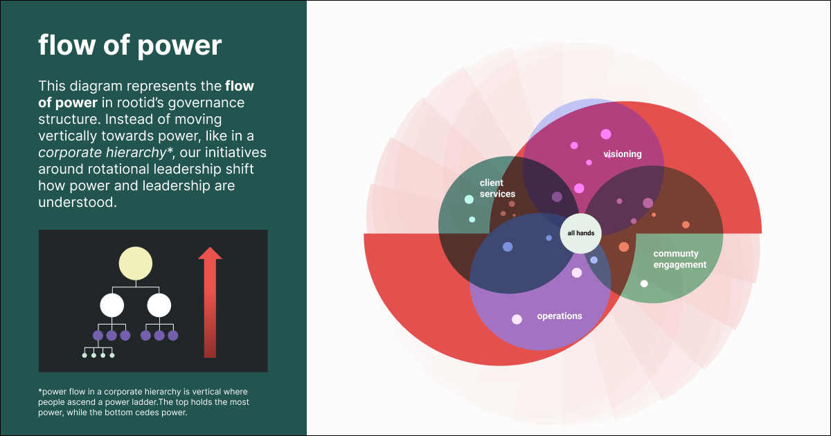
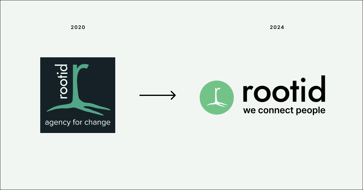
So much has changed since we were initially founded in 2011 (learn more about our history). Our team has grown and our leadership model has evolved. Our mission has become more defined and inclusive of the diverse work that we do. Also, our community has grown, and we are consistently learning more about their needs and how we can support them. When we started this process in 2022, we realized that our visuals were dated and failing to reflect our growth. Our new visual direction needed to embody our values and illustrate our more intentional processes.
how is the new branding different?
Our updated visuals use geometry as metaphor for building equity-centered, systematic processes; geometry is culturally familiar to all and embedded in the world around us. We wanted to keep elements of our warmth and playfulness, so our new look makes space for the more organic qualities of our original brand but within a structured framework. This represents us maturing and evolving, without forgetting our essence and humble beginnings. Our new brand is also grounded in accessibility, inviting more of our community to feel closer to our culture.
what are the goals of these new changes?
Our main goal is for our work to help organizations foster inclusive, effective communications that center and connect people. By refining our own internal processes and updating our offerings, we hope to empower teams to achieve greater alignment and communication practices. We are committed to exploring how our work can affect change.