When someone says the words, “it’s time for a rebrand,” does your heart skip a beat?
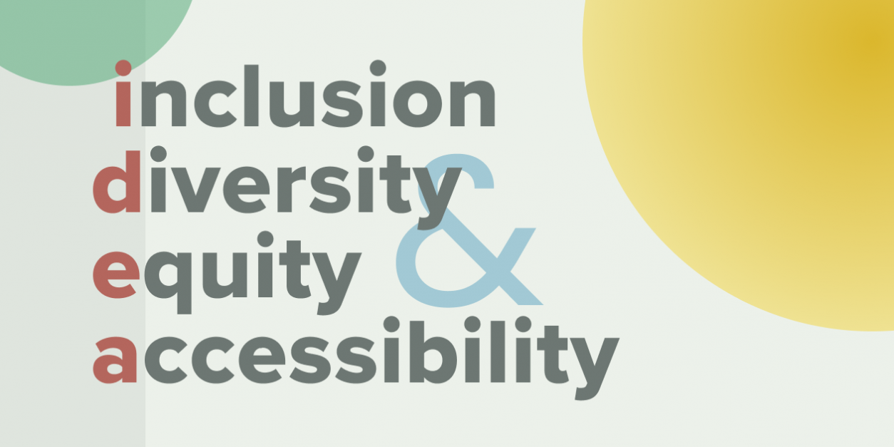
In this 3-part series, we will examine a community-centered, values-embodied approach to the rebrand process. Part 1 will explore how we begin by centering the needs, experiences and voices of those closest to the outcome of our work, inviting you to examine how perfection and urgency might show up for you and your team. Part 2 will invite you to dive deep into iteration and ‘safe to fail’ experimentation, using liberatory design process principles to ‘imagine,’ ‘prototype’ and ‘try’ new approaches to your communications strategies and materials. Finally, Part 3 will discuss ways to embody IDEA (Inclusion, Diversity, Equity & Accessibility) values in your brand rollout.
Part 1: Making the Case for Doing This Differently
Does just the idea of rebranding, changing your logo, messaging and the rest of your visual identity across your various print and media assets send a shiver up your spine as you think about the stakeholders you will need to include, and the opinions you will need to balance? The politics and fear that this process evokes can trouble even the most well-balanced, calm and intentional organization.
Re-envisioning your brand is a huge undertaking and though it should be taken seriously, it does not need to cause as much heartache nor as many headaches as it often does.
Instead, what if we imagined this as an iterative process that worked into your everyday workflow?
An interactive process invites:
stakeholders and constituents to be included
direct as well as anonymous feedback to be collected and iterated upon
everyone to feel like they are part of a cohesive and collaborative team experience
What if I were to tell you that this process does in fact exist; newly termed the Community Centered Rebrand. In the Community Centered Rebrand, the visual materials are designed, tested and retested in real time response to internal staff and community input. Your messaging is iterated upon as you go; and your logo redesign comes last.
Let’s take a step back and remember that marketing is an experiment—technologies are constantly changing, politics and funding are often in a state of flux, and internally there is always some amount of team turnover and institutional knowledge gained and lost. It is only our dominant culture (read white supremacy culture characteristics, in particular, perfectionism and sense of urgency) that tells us we need to get it perfect on the first try, or somehow ‘flip a switch’ and change everything at once.
We do not take for granted that this is serious business and could potentially change the trajectory of your organization, but taking a more iterative, community-centered, and thoughtful approach makes this process feel more collaborative, connecting, and trust-building rather than exclusionary, problematic, power dynamic focused, and, well, often soul crushing.
Iterating vs. Perfecting
The problem with the typical rebranding process is that everyone goes into it with the pressure of perfection looming over them. Many Executive Directors don’t even want to touch it with a 10-foot pole because of the stress that the mere idea evokes. The complicated feelings and power dynamics between board members and senior staff are often centralized in this process, But, what if we approached rebranding work through the lens of IDEA (Inclusion, Diversity, Equity & Accessibility) and used the liberatory design process as our guide?
An approach like this has the potentiality to bring people in your community closer together, galvanizing support for your mission and in turn “contributing to greater organizational capacity and social impact.” (Stanford Social innovation Review)
The idea behind the Community Centered Rebrand, prioritizes the needs of your internal stakeholders and those you are in service to by beginning by assessing where you are, what‘s working, what’s not, who comprises your audiences and stakeholders; and how you want them to feel about your organization at the end of this process.
The first step is to look at your communication assets and materials. Ask your staff what materials they need to be more successful in their work, what tools would make their lives easier, what assets community members need that they are not getting as easily as they could?
Begin by redesigning these materials first since they are actually the most impactful brand vehicles you have.
To begin this redesign process, we start by creating mood boards. Mood board development allows you to establish an updated visual language for your organization without addressing your logo, and is a great tool for community inclusion.
Mood boards are collages/collections of fonts, imagery, colors, photography treatments and other elements (that best represent your org) that you can share with community members for feedback. We often begin this process with a community town hall where we have group discussions around color theory, fonts, imagery, etc. feel most aligned with your organizational core values and how those can potentially be applied across various contexts. We will usually include initial mood boards or sketches at this time as well as a survey to gain anonymous insights & feedback from those who either can not attend or are not comfortable sharing their perspectives publicly.
Words for the Wise
In order to make this work feel accessible and inclusive please provide materials at least 24 hours hours ahead of time, translated into whatever languages are needed in your community and make sure you have interpreters for the event itself. If you are thinking, ‘that is too much work’ or ‘we can’t afford that,’ consider from the perspective of those in your community who are neurodivergent or non-English speaking, even if they seem fine with however you communicate regularly, they will probably appreciate the additional care you have taken.
When we create mood boards, we usually begin with 5 directions and iterate over 3 rounds till we land on one final direction. We then use the final version as the basis of our updated visual language. Mood boards are great because they can also act as a mini-style guide that you can build upon.
Now it is time to start updating collateral and other communications assets. In your anonymous survey you would have included a few questions about what assets people really use on a regular basis and what tools would help them do their jobs more effectively. That information will be what determines which materials to start redesigning first.
The board and senior staff may lean toward choosing your Theory of Change, Annual Report or Strategic Plan, because those are often what funders or external partners want to see, but this approach centers the needs of your internal staff and those you are in service to, first. So when or if you feel pressure to begin with one of the above assets, take a moment to consider those materials are useful to the rest of your staff. Depending on your answer, perhaps consider that a slide deck, brochure, one-sheet or flier template might be a more useful first choice?
In Part 2 of this series we will explore iteration and ‘safe to fail’ experimentation using liberatory design process principles to ‘imagine,’ ‘prototype’ and ‘try’ new approaches to the application of your new visual language across your branded materials.
Stay Tuned!